5 Reasons To Light Films With Colour
INTRODUCTION TO COLOUR
Since the dawn of three-strip film in the 1930s every cinematographer has been aware of the importance of using colour to create images. Different palettes can be constructed by using production design, introducing a look in the grade, or, as we’ll discuss today, with lighting.
There are many reasons to use different coloured lighting when you shoot a scene, so today we’ll go over 5 of them. By looking at a few clips from popular movies as well as some footage I’ve lit using different hues.
1 - MOTIVATED LIGHTING
Every environment that we walk around in has different frequencies of light bouncing around which - to both our eyes and cameras alike - read as colour.
Therefore, one of the most common motivations for illuminating with a vibrant hue, is to replicate or supplement what we call practical sources - lights that are seen within the frame of the shot - such as a lamp.
Here I’ve set the colour temperature of the practical in the background to 3,200K, then to increase its intensity and direction I’ve added a film light rigged above as a backlight. I’ve set it to the same colour temperature as the practical - supplementing the warm light that already naturally exists in the frame.
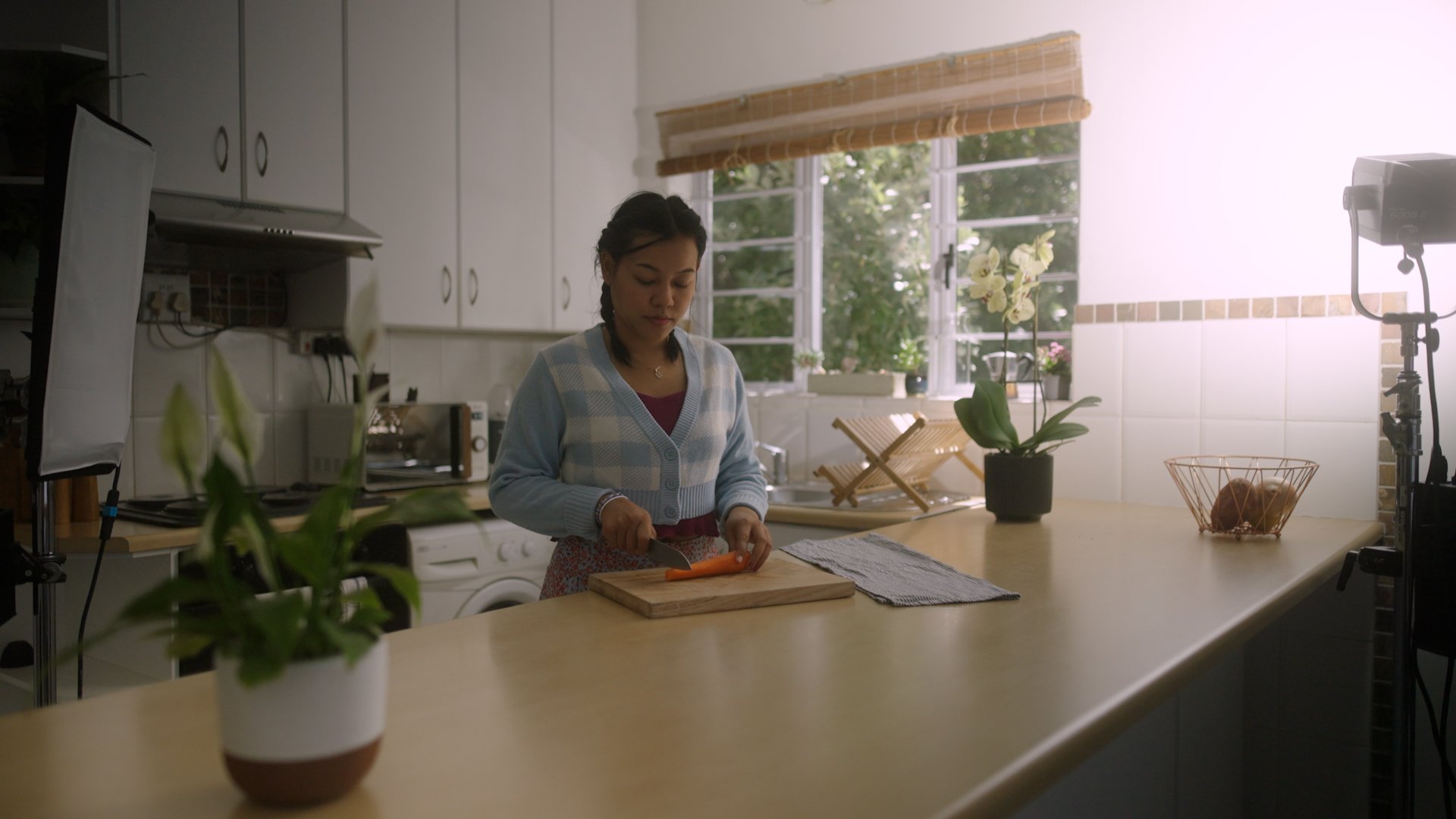
A big trend now is for DPs to build practicals into sets or locations - which are usually RGB so that they can be adjusted to different hues to add accents of colour to the lighting. Those practicals could be Astera Titan tubes posing as fluorescent bulbs, RGB strips built into signage, or yellowly, warm kitchen lights.
As well as adding coloured practical sources that can be seen in shots, another idea linked to this is to create motivated colour lighting - where the light isn’t necessarily seen in the shot, but the direction, colour and quality of the illumination still feels relatively realistic and motivated - like that light could be there just outside the shot.
One way to do this when shooting an interior is to shine a light through a window - with the imaginary motivation for it being that there is some kind of street lamp outside that window.
Here I’ve used a hard source with a sodium vapour gel outside a window which gets cut into strips of light and shadow by shutters. I’ve then used a cooler fill inside to motivate the dusky blue natural light outside and lift the ambience a bit. I’ve rigged this light on a C-stand so it backlights her in the same direction as the natural light coming from the window.
So, although we don’t see the exact source of light in the shot, it’s probably within the bounds of reality to imagine that there might be an old sodium vapour street lamp outside this apartment window.
Creating these extra imaginary sources is especially useful in night scenes for lifting the exposure so that there’s enough light to be able to shoot, but there are also other psychological motivations for lighting with colour.
2 - AGITATE VISUALS
When shooting exteriors or interior scenes that take place during the day, the default colour temperature to light with and set the camera to is around 5,600K.
If both the colour balance and light source match, you’ll get ‘normal’ looking natural colour - with white surfaces reading as white.
Some filmmakers like to use this look as a base for daylight scenes - but then add smidges of more vivid colours to parts of the frame. Now, I can’t speak to the intention behind these lighting choices, but I have noticed that within certain contexts this can have an agitating effect.
Take this location from The Bear. In different scenes there’s this ever present, just off camera red light - which adds a different hue to the otherwise naturally lit space. It’s subtle, but to me this visually ratchets up the tension just a tad - which suits the ongoing chaos and agitating tone that also comes from the story and direction.
There’s something about using a strong hue in contrast to the otherwise natural lighting, especially when it hits the skin tone of a character, which is slightly off putting and brash.
Uncut Gems is another film that does this - often mixing garish pink and off-green lighting, with more traditional CCT sources. This gives skin quite a sickly, unhealthy tone, which psychologically adds to its already tense, off kilter, chaotic atmosphere.
3 - DEPTH & SEPARATION
So far we’ve seen that lighting with colour can be done for motivational purposes or to induce a psychological feeling, but it can also be used for more classically photographic or aesthetic reasons.
More often than not, cinematographers like to use lighting to create different planes within the image. This creates an illusion that the 2D image has depth, feels more dimensional and can be used to separate characters from the background to make them better stand out.
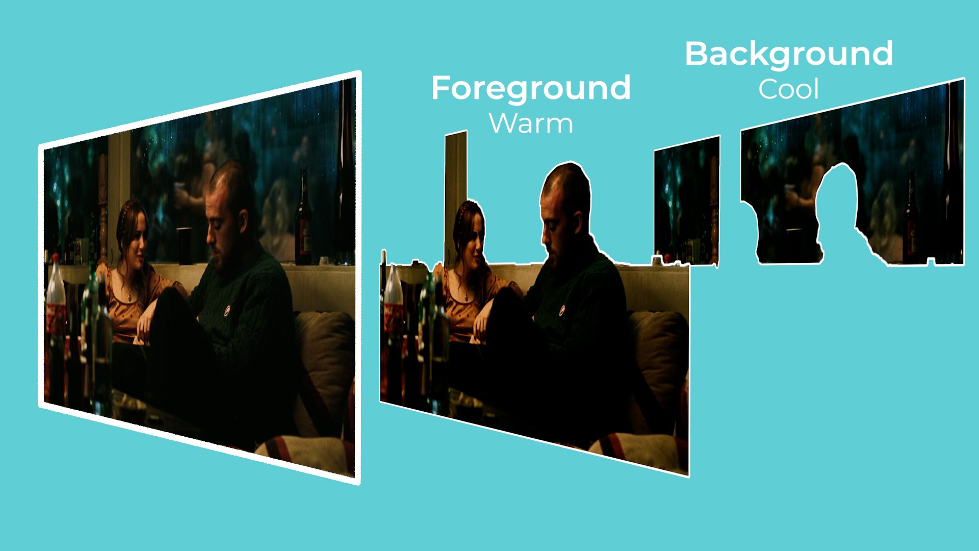
They can do this by lighting different areas in the image, such as the foreground and the background, with different amounts of light, or with different colours.
The colours that cinematographers choose to place within the different planes of the image are also quite deliberate. Complementary colours are hues that sit at opposite ends of each other on the colour wheel. These tend to be quite visually pleasing to the eye when they are paired together.
This is why you often see films use a warm practical lamp in the background, that counteracts with a cooler light on the subject in the foreground.
Not only are these colours complimentary, and therefore aesthetically appealing, but they are also placed in different planes or dimensions in the image - cool, warm and cool - increasing the feeling of depth and breaking up the subject from blending into the background.
Some other complementary or often used colour combinations besides cool and warm include: a dark orange and green, red with a lighter blue or cyan, or a pink-purple with a tungsten yellow.
4 - EMOTIONAL REALISM
There are many cinematographers, such as Vittorio Storaro, who like to talk about the psychology of lighting with certain colours. While the idea that different colours can be used to evoke specific emotions or themes is a whole other subject on its own, I think it's safe to acknowledge that as a whole colour affects mood and how images are experienced by audiences.
For that reason, cinematographers can sometimes deliberately exaggerate colour outside the bounds of reality so that the world represents how the character feels, rather than what it looks like in reality.
This is something that DP Marcell Rév referred to as emotional realism when shooting Euphoria.
As an example let's take this bathroom space, which in real life is lit by a rather ugly overhead tungsten bulb, and apply two different lighting looks to it to evoke two different feelings.
I’ll start by rigging the 60C on a polecat, so that we don’t see it in the reflection when shooting. It provides a nice downward, top light onto the subject.
Then I’ll place a second source so that it shines through the window, adding ambience and a different plane of light on the back wall.
For the first lighter, brighter, more upbeat tone and look, I’ll set the overhead source to a 5,600K daylight temperature, with a layer of diffusion to soften its intensity. I’ll set the outside hard COB light to 5,600K with an added quarter CTS gel to give it a warm, morning glow.
For the second harsher, darker tone, I’ll remove the diff on the 60C to make the downlight harder and set it to a fluorescent green gel look. I’ll then remove the CTS gel on the light outside and instead warm it up to 2,700K so that it takes on a tungsten look.
I’ll then decrease the camera’s exposure and balance the lights through dimming their intensity values to get a look that feels much dingier and far emotionally darker in tone than the first lighting set up.
By just tweaking the colour, quality and intensity of the two sources we can create two looks that put the character in a radically different emotional space.
5 - STYLISED COLOUR
Apart from all the above reasons for using colour it can also be used because, well, it just looks kinda cool.
One of the easiest ways to create a more visually stylised look with lighting is by using different hues. This is often done in short form content like music videos where realistic lighting can be thrown out of the window, and colour is used to elevate the visuals and inject an energy into them. Using a stylised colour palette rather than a naturalistic one.
It’s also a favourite party trick of YouTubers. Light the background wall with one RGB colour, then place another colour RGB source that only illuminates the subject in the foreground and just like that…you’re a YouTuber.
The reason this works comes back to the idea of using complementary colour and lighting different planes in the frame to separate the subject from the background.


