Dune: Part Two’s Bold Cinematography
INTRODUCTION
While the first Dune movie was being showered with praise at the 2022 Academy Awards, director Denis Villeneuve, DP Greig Fraser and the rest of the heads of departments were actually hard at work - preparing to shoot the sequel.
Part Two was even more ambitious. If Part One built the world and set all the parts in place, Part Two dived straight in with an escalation in drama and an abundance of large scale set pieces.
So, let’s take a closer look at the cinematography and show how Dune achieved such bold, ambitious, epic visual storytelling.
VISUAL APPROACH
“Whenever you do a movie you’ve got to solve a series of problems and some of them are technical. Like, how do you get a bit of equipment to a certain place. And then there are creative discussions. And a lot of the technical stuff had been solved for us in advance because we’d done Part One.” - Greig Fraser, Dolby
This, along with the critical and financial success of the first movie, emboldened the filmmakers and got them considering how they could creatively and visually elevate Part Two.
One of the early crossroads they arrived at was how closely they should retain the look and feel of what they had done in the first film, or if they should deviate to shooting a different format, use a different palette or implement different lighting ideas.
They landed on maintaining most of the look of the original, keeping a visual continuity in the cinematic world, but elevating that look in subtle ways, or at times by employing riskier creative decisions - like infrared black and white - which we’ll get to a bit later.
CAMERAS & FORMATS
A starting point for the look came from the camera and lens selection. Both films were designed to be released across two, or actually three, exhibition formats. Two different, taller aspect ratio formats for Imax cinemas, and a 2.39:1 widescreen format for regular cinema and streaming distribution.
Part One used two different types of lenses - spherical Panavision H-series lenses to capture the taller Imax scenes and the 1.6x anamorphic Panavision Ultra Vista lenses for non-Imax widescreen scenes.
For Part Two they kept the same large format look of Part One which they shot on the Alexa Mini LF, while also adding an extra even larger format Alexa 65 camera.
Fraser switched up his lens selection on Part Two - getting rid of the anamorphic lenses and shooting entirely with large format spherical glass. Doing this meant that they would chop off the top and bottom of the image to arrive at a widescreen aspect ratio, rather than shooting anamorphic and getting this ratio natively.
The advantage of this is that they could then preserve the height of the frame for the taller Imax distribution aspect ratios - having greater cropping options for all the different distribution formats in post.
LENSES
When it came to choosing which spherical lenses to shoot on there were two important factors that affected this decision. Firstly, they had to be large format cinema lenses with enough coverage for the LF and 65 sensors without vignetting.
Secondly, Fraser sought glass that came with a bit of vintage texture which would counteract the large format, high res, crisp digital Alexa sensors.
He landed on two different sets of lenses. One set of Arri Rental’s rehoused version of vintage Moviecam lenses from the 1980s - with the prime focal length lenses ranging from 16mm to 180mm - that have gentle, natural character, a feeling of depth and beautiful focus falloff.
These were combined with textural, large format Soviet-era glass which were custom rehoused for modern use by IronGlass.
FOCAL LENGTHS
Going through the film we can see that Fraser often elected to shoot on longer focal length primes. Shooting on these telephoto focal lengths have the effect of compressing the background and giving images the feeling that the landscape is closer to the characters than it would on a wide angle lens.
I think this is a beautiful way of giving the sand dunes more of a layered depth, showing the scale of the characters within the vastness of the imposing desert and making the environment itself feel like a character.
GROUNDED PHOTOGRAPHY
One of the biggest reasons that I think makes this film successful is how they melded a level of reality and believability to a fantastical story.
One of the pitfalls of many studio blockbusters that take on stories in unrealistic, imaginative cinematic universes is that when the visual language of the filmmaking also takes on an unrealistic tone I tend to get pulled out of the story and lose interest.
In Dune, even when fantastical, impossible things are happening on screen, because it’s shot in a way that is tethered to reality - I stayed fully invested with the characters, on the edge of my seat.
“When you’re shooting something so larger than life, it’s important I think to give the audience a grounding. Because if you then suddenly start to become unreal with a situation that’s unreal it doesn’t, kind of, work.” - Greig Fraser, Dolby
The costumes feel textural, like they’ve been worn. The environments are authentic, and don’t look like they’ve been shot against a green screen in a studio. When there are visual effects they feel fully integrated and a seamless part of the live action footage. The sci-fi technology has a mechanical believability.
And, importantly, the camera is always positioned and operated in a real way that conforms to physics. The perspective never goes through walls, swoops around the sky or moves in an unnecessary, unmotivated way.
The shots are usually operated from the ground and have a subtle handheld looseness to them. Or if the camera does move it’s usually tracking the motion of characters.
Always keeping the photography grounded in reality.
B&W INFRARED
So, part of the look relied on keeping the cinematography grounded, however certain moments and set pieces like the eclipse scene or the introduction of a new planet Giedi Prime introduced very bold, stylistic photographic ideas.
One concern that they had when introducing a new planet and character to the story was that audience’s may get confused between it and the main planet Arrakis. Giedi Prime would be introduced with an exterior scene, in a sand pit, with a similar neutral colour palette to Arrakis.
To avoid confusion Villeneuve proposed communicating this change in location by switching to a monochromatic palette. Fraser stylistically elevated this idea even further by proposing black and white infrared.
But what exactly is infrared?
Well, cameras capture wavelengths of light. There is visible light that our eyes can see and also light at different wavelengths which is invisible to the naked eye.
To make sure that none of these infrared light wavelengths outside the visible spectrum bleed into the regular colour space captured by cinema cameras - which would distort capturing realistic colours - manufacturers add an infrared filter in front of the sensor which cuts out these rays.
However, if you deliberately remove that infrared filter in the camera and replace it with a visible light cut filter then the camera will only capture infrared light.
They did exactly this, by stripping away the infrared filter layer from the Alexa sensor and adding a filter in front of the lens which would cut out any excess blue, green and red visible light. This image could then be desaturated into monochrome for on-set monitoring and post production.
Infrared light isn’t exactly flattering to actors. When shooting characters under hard, direct, toppy sunlight it gives them a frightful, intimidating pale appearance with dark eyes - an accurate emotional representation of the central sadistic character from this word.
COLOUR PALETTE
Overall the colour palette on Arrakis closely follows that of the first film - leaning heavily into a neutral look with browns, hot, white skies, greys and blacks.
However, they decided to start the opening scene with a bang by letting it unfold during an eclipse. To create a distinct look Fraser used a filter that cut most of the green and blue light but kept the visible red light.
This pushed a darker orangey-red palette into this scene with much denser, graduated orange skies than the regular palette.
LIGHTING
There’s a tendency in modern filmmaking to use an abundance of soft light. If there’s harsh sun outside, most cinematographer’s first instinct is to throw a scrim over the talent.
However, part of the beauty of Dune comes from how Fraser works with a combination of soft light and hard light. He creates a feeling of heat by keeping the light for exteriors hard with a crisp distinction between solid shadows and areas with highlights. Pushing the exposure up the curve to a brighter look.
When the characters are inside, he decreases this idea of the harsh sun by lighting with a much softer, more diffused look with a gentle gradient between shadows and highlights. He’ll weight the exposure far darker for these scenes.
Sometimes punctuating these indoor spaces with little pockets of hard light - reminding us of the overpowering nature of the desert sun outside.
He masterfully takes a visceral feeling and communicates it using light.
FILM OUT
If you want to incorporate film into a movie’s workflow - you can either do so at the beginning by shooting on it, at the end by making a film print for screening, or both.
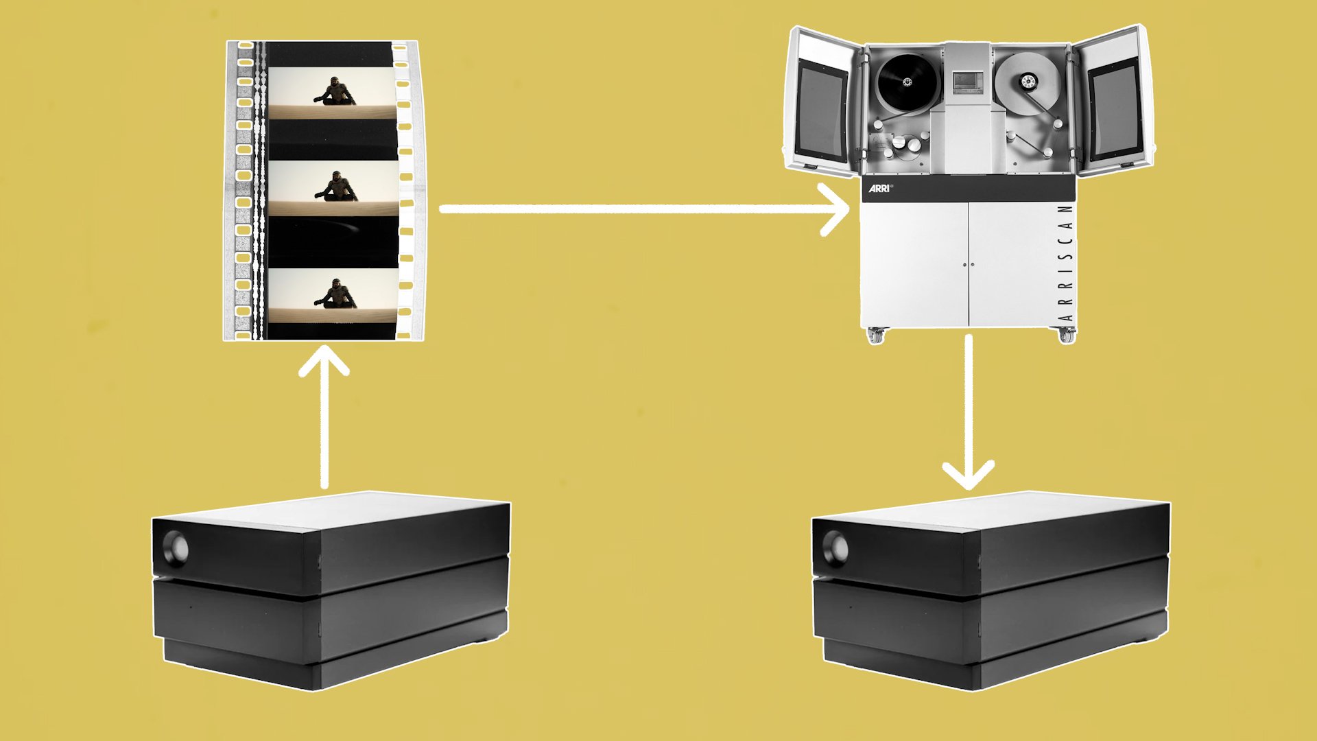
Dune did something interesting. They decided to shoot on digital, present on digital in most cinemas, but inserted an extra step in the middle of this process called ‘film out’. This took the graded digital footage, laser printed it onto Kodak Vision3 5254 film then rescanned it back to digital.
“We went out to film negative and then scanned it back in. It was night and day what it gave the highlights, what it gave the patina, what it gave the texture.” - Greig Fraser, Dolby
The reason for this back and forth was that they felt that shooting on film looked too sentimental, while acquiring on digital felt too sharp, clean and lacked the texture they wanted the world to have. By doing a film out they got a bit of the best of both worlds.


