Cinematography Style: Agnès Godard
INTRODUCTION
Agnès Godard crafts images that provide viewers with a tactile and sensory experience, that uses textural photography, soft but naturalistic light and an abundance of close ups to immerse the audience and create a visceral impression of how the characters navigate the world.
So, let’s dive a bit deeper into how she became a DP, her thoughts on cinematography and look at some of the gear she uses to create images.
BACKGROUND
After graduating from film school she began working in the camera department as a technician - most notably working as an assistant on movies by Wim Wenders.
In fact it was on one of those shoots - Paris, Texas - where she met another crew member Claire Denis who was working as an assistant director.
When Denis embarked on her first feature as a director she selected Godard as the camera operator. She later stepped up as a director of photography on most of her subsequent films, forming a long running collaborative relationship with Denis, whose work often focused on intimate portraits of characters on the edges of society.
“I have a very long collaboration with Claire Denis. We’ve made 16 films together, which is a lot. What I got out of it, in any case, was the following reflection: the more we’ve gone for something that’s concise, the denser and stronger it became. And I realised that sometimes simplicity is the result of work and maturation.”
Much of her work condenses the photography into a fairly simplistic approach where how the camera moves and how scenes are lit isn’t overly convoluted, choreographed or rehearsed. She strives to make the presence of the camera disappear and have each shot contain everything that needs to be said in a primitive, simplistic way.
As a result, I’d say much of her work errs on the side of naturalism or realism, sometimes elevated by an experimental edit. When shooting exteriors she embraces the natural light and doesn’t try to over diffuse it, shape it or try to contain it.
However, I wouldn't say that her approach is purely centred on realism either. Sometimes, she’ll add colour to her lighting, going with a sharp blue for night exteriors, or a cool teal for street scenes.
Another component of photography which she elevates out of the ordinary into more of a dreamy, meandering state is how she frames shots and moves the camera. Her frames will often flow over spaces and characters with gradual pans and tilts, or take on a rougher, handheld perspective.
This framing and movement is considered and based on the foundational idea in her photography that the camera can be used to shape the perspective and the emotional and physical proximity to the characters.
“In terms of the image, perspective is something that defines a distance, first of all. So let’s say, in terms of images, the distance from which we watch a filmed subject. The distance at which the camera will be placed. It’s something very important, as it’s the distance from which you come into contact with the characters of a film.”
The perspective of the camera is rarely locked onto one character throughout a movie, and instead drifts from person to person, or from detail to detail, like the wandering eyes of an observer in a room that is never seen.
This drifting style of operating allows audiences to pursue different details within the frame, as the camera tilts or pans from objects, textures or details up to the subject.
To get this feeling she’ll often position the perspective of the camera to be quite close to whatever is being filmed. Filling the frame with tactile close ups, whether those be of characters, cutaways to details which inform the story, or doing those dreamy camera pans and tilts.
An interesting idea she’s described during her work with Denis is ‘writing’ the movie on set, through how the images are created. Arriving in a space where all the ingredients are put together, from the location, to the actors, the mise en scène and costumes, and then ‘writing’ the film by creating frames in the moment, rather than the standard idea of getting a script and then illustrating what has already been written.
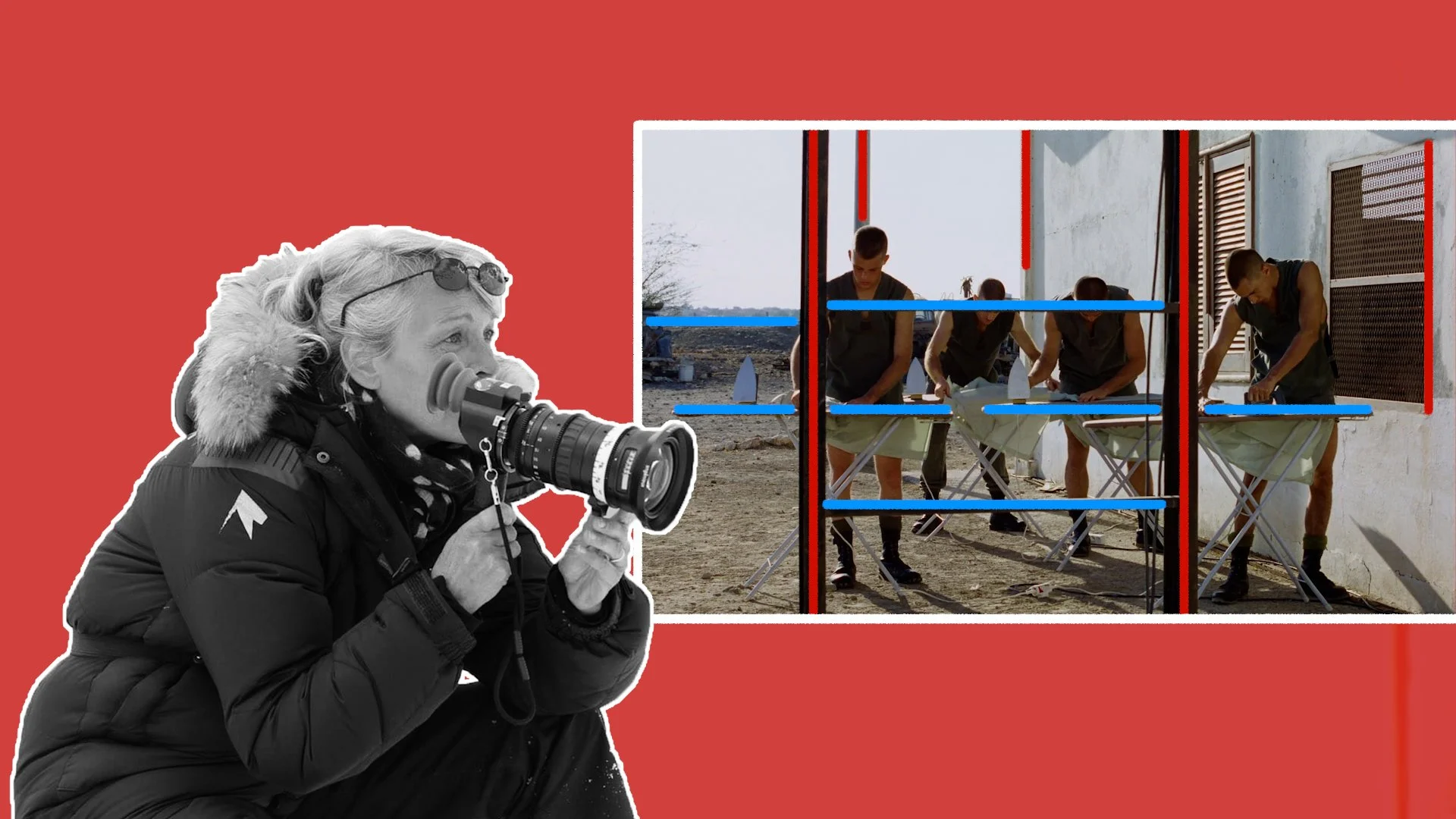
I’ve noticed that her framing often includes vertical or horizontal lines within frames which intersect the image - whether from architectural or production design elements, or from using the line of a straight horizon to cut across the frame.
GEAR
As we mentioned, perspective and distance hold a very important place in her work. Her decisions as to where to place the characters and the camera, also have a direct impact on the kind of gear which she selects.
Rather than choosing very wide angle lenses and shooting them from a close distance to the character - as has become a popular cinematic trope nowadays - she instead often selects medium focal lengths or telephoto lenses, like a 40mm or longer, and places the camera a bit further away from the actors.
These longer lenses compress the image more, making the background feel closer to the characters and creating a layered feeling of depth where different planes of foreground and background layers are pushed together and assembled within the frame.
This effect of using long focal length lenses is particularly noticeable in exterior wide shots where far off landscapes feel like they are looming right behind characters. These compressed backgrounds place characters alongside their environment, rather than shooting with wide angle lenses that distances the background from the subject.
Longer lenses, with their lack of distortion, also make lining up vertical or horizontal straight lines in shots a bit simpler.
A secondary effect shooting on longer lenses has is that she can place lights further away from characters. The wider focal length that is chosen, the closer the camera will have to be to characters, and therefore the closer lights will have to be placed to actors so that the camera won’t come in between lights and cast shadows.
Godard prefers to have some distance between the light source and the subject, which sometimes makes shooting further away on long lenses easier as the camera and crew won’t get in the way of the light source.
Her camera selection has been split between shooting on 35mm film in her earlier work and on digital cameras in the more recent years.
During her early work she often favoured a lighter camera, which could be easily operated for handheld, and could fit into tight spaces - which, for her, was a Aaton 35 camera body.
She paired this camera with different spherical lenses - normally favouring the height of taller aspect ratios like 1.85 or 1.66 and staying away from the widescreen anamorphic look. Some lenses she’s used include the Zeiss Standard Speeds, Cooke S4s and Panavision 70mm and Primo glass.
Shooting 35mm film, with its wider perspective than 16mm, on the Aaton 35 with Panavision Primo primes that resolved beautiful skin tones accurately with a fast T1.9 stop was a combination she often arrived at, and can be seen in her iconic work on Beau Travail.
“I really wanted to have this 35mm perspective because I thought that to see the bodies, the men, in the landscapes was the thing. Then I chose very performant lenses. So I worked with Primo lenses from Panavision and they were fantastic. The only thing is that they were quite big.”
She’s also used zoom lenses quite often, usually from Angenieux, such as the classic 24-290mm, the 15-40mm and even the newer EZ Full Frame 22-60mm and 45-135mm zooms on her more recent work. She combined this with a teleconverter when she needed to extend her focal length range even further.
After transitioning to digital cinema with the Arri Alexa classic, she’s since moved to mainly using Sony camera bodies. From the earlier model F65, to, in more recent years, using the Sony Venice.
This change in camera selection from the lightweight Aaton 35 to the large, cumbersome Sony F65 also yielded a change in approach to how the camera moved.
The Aaton allowed her to operate raw, handheld over the shoulder shots, or easily place the camera on boats, trains or tight spaces to get shots which vibrated or shook with the movement of said transportation method.
Whereas the larger weight and size of the F65 meant that movies like Let The Sunshine In were shot completely off either a dolly or tripod which stabilised the camera and gave the images a more grounded feel.
Her lighting largely leans into a natural look, using sunlight whenever she can, whether it's soft, diffused, luminant and ambient, or hard, direct and sharp with strong shadows.
For day interiors she often supplements this with large bounced or diffused sources which illuminates actors with a very soft quality. Then, during night scenes, she has a tendency to introduce colour, sometimes favouring warm tones such as sodium vapour street lamps, and other times going for cooler tones from blue to a teal.
CONCLUSION
Although her exact approach has shifted from film to film and director to director, there is a certain natural, dreamy, reactive, wandering quality to her photography which has carried through. Transforming the camera from a machine that captures light into a perspective and point of view of an observer in the room.


